
Responsive Web Design: How UI/UX Design Improves User Experience
Discover how responsive web design and UI/UX improve mobile usability, simplify navigation, boost website performance, and create better user experiences.

Introduction
You tap a link on your phone. The page loads. Then you have to pinch, zoom. Scroll sideways just to read one small paragraph. Most people don’t stick around. They hit the back button. They go to the result. The business behind that page? It never gets a chance.
Responsive web design was developed in order to overcome precisely this challenge. These days, users browse from their phones, tablets, laptops, widescreen computers and sometimes even their television sets. A website has to be intuitive to use in all of these scenarios and not only look decent in at least one of them.
The key point about responsive web design is not in fitting everything into a small screen format but in making certain design choices – the placement of buttons, the way navigation works, the loading time of pages and the ease of finding the information the user seeks. This is where the UI/UX Design Best Practices come into play.
What Is Responsive Web Design and Why Does It Matter?
Responsive web design is an approach to building websites so that the layout, images, and content adjust automatically to the size of the screen they're viewed on. Unlike traditional designing where there will be different designs for desktops and for mobile devices, in responsive web design, a single page is created for all the devices.
The concept of responsive web design was introduced by designer Ethan Marcotte in 2010. A good responsive website design makes use of fluid grids, fluid images and CSS media queries so as to rearrange contents according to the device being used. For instance, while using a laptop, the arrangement may be that of three columns, but when using a phone, the contents may be arranged in one single column which can easily be scrolled through.
How Responsive Design Actually Works
In technical terms, there are three main components that make responsive design work:
Flexible grids: Layout dimensions are specified using relative units such as percentage units, not absolute units like pixel values.
Fluid images and media: CSS rules that apply different styles depending on the size of the screen.
Media queries: Images and other media fit inside their containing element and don’t overflow.
Here's a simple example of a media query that stacks content on smaller screens:
@media (max-width: 768px) { .columns { flex-direction: column; } }
And one line that every responsive page needs in its HTML head so phones render it at the correct width:
<meta name="viewport" content="width=device-width, initial-scale=1">
Why It Matters More Than Ever
More than half of the world’s internet users access websites via their mobile devices. If your website doesn’t have an easy user experience on mobile, it makes a bad first impression to most of your visitors.
It also matters for search engines. The mobile-first indexing strategy used by Google means that it takes into account the mobile version of your page when ranking it. Mobile friendly Website Design is no longer an option – it is a must-have for visibility online.
The practical benefit of this design approach for you is cost-effectiveness. It is much easier to manage a single responsive website than having to keep two websites up-to-date at the same time.
How UI/UX Design Shapes Responsive Web Design
Layout can be made flexible by code, but it is design that determines whether that layout is easy and pleasurable to use. This is when User Experience Design becomes important. UX Design looks at the complete customer experience, whereas UI design concentrates on the visual and interactive elements used by the visitor to navigate through the website. Both together form Responsive UI/UX Design – a site that is not only scalable in terms of layout, but responsive to each individual visitor.
UI vs. UX in a Responsive Context
Imagine Responsive UI Design as "the look and touch" layer of website design. It includes legible typography, buttons of sufficient size, appropriate spacing and intelligent cropping of images for narrow devices.
Responsive UX Design is a much more complex layer. Here come questions like what is the purpose of a mobile visitor's visit and should the site provide quick access to the contact information, or maybe the form should be broken down into several short steps? This can be quite different for a visitor using a laptop and a person viewing the site on his smartphone standing in line for coffee.
Start Small With Mobile-First Design
Mobile-First Design means you design for the screen first then add layout and features as the screen grows. It sounds like a change in workflow but it actually changes how you think.
When you only have an inch of space you’re forced to decide what truly matters. Extra banners, decorative widgets and secondary links tend to fall. The result is a cleaner experience on every device, because the desktop version is built on a focused foundation rather than a cluttered one squeezed down.
In CSS, mobile-first usually means writing your base styles for phones and using min-width media queries to enhance the layout for larger screens.
Core Responsive Web Design Principles
A handful of Responsive Web Design Principles show up in almost every successful project:
Content priority: Determine what is the purpose of a website and ensure that this content will load first on small screens.
Fluid layouts: Make use of relative units and flexible containers to prevent any breaking point among standard breakpoints.
Touch-friendly targets: Aim for tap targets of at least 44 to 48 pixels with enough space between them.
Readable typography: Keep body text around 16 pixels or larger, with comfortable line spacing.
Consistency: Colors icons and interactions should behave the same way whatever the device
Performance: A responsive page that loads slowly still delivers a poor experience.
These ideas sit on top of broader User Experience Design Principles such as clarity feedback and accessibility Users should always know where they are, what they can do next and what happened after they clicked something.
Designing for Touch, Not Just Small Screens
Good Mobile Interface Design understands that fingers are not as precise as a mouse cursor. On phones there is no hover effect. So any information that depends on a hover needs a way to show up. Swipe gestures, call-to-action buttons and placing key elements near the bottom of the screen make a website feel built for mobile. It doesn’t just feel like a desktop site squeezed into a space.
Choosing a Responsive Design Framework
You don't have to build every grid and component from scratch. A Responsive Design Framework such as Bootstrap, Tailwind CSS, or Foundation gives you a tested grid system and ready-made components that already handle common breakpoints.
These frameworks speed up development. Help keep design consistent across a team.. There is a downside. Sites can begin to look similar and extra code that isn’t used can slow things down. Many teams use a framework to set up the structure then change the styling a lot so that the brand still feels different. Also native CSS tools, like Flexbox and Grid have gotten so strong that smaller projects often choose to skip frameworks.
Practical Tips to Improve Responsive Web Design and User Experience
There is nothing worse than having some good ideas but not knowing how to apply them. Here are the aspects which affect visitors most of all.
Keep Navigation Simple and Predictable
Website Navigation Design tends to fail at small screens first. Eight navigation elements placed horizontally work just fine on desktop screens, but it is a total disaster on a mobile device.
A few habits help:
Restrict top-level menu items to five-seven only.
Place a prominent menu icon on mobile screens, as well as add the word “Menu” near it.
Add a search bar to the websites containing a lot of information.
Make the logo link back to the homepage, because people expect it to.
Provide breadcrumbs on deep levels of hierarchy.
It’s time for the main idea – the task of website design is to let visitors find everything within a few clicks.
Build a Clean, Consistent Interface
Website User Interface Design best practices depend on creating hierarchy via design elements. Headings and buttons, the most critical UI elements, need to visually catch users' attention by size, color, placement and other characteristics. Supporting details can sit quietly in the background.
White space is your friend here, especially on mobile. It gives content room to breathe and makes pages easier to scan. Use a limited color palette, stick to one or two typefaces, and make buttons look like buttons. When every page follows the same patterns, visitors spend less effort figuring out the interface and more time on your content.
Make Speed a Design Priority
A stunning website layout will not help you much if the visitor leaves before its loading. Mobile Website Optimization is about designing pages that load quickly on mobile devices, especially since phones usually have slower Internet connection and processors than other devices.
Practical steps include:
Compress images and serve modern formats like WebP or AVIF.
Serving smaller images on smaller devices using srcset attribute.
Using lazy-loading for images below the fold with loading="lazy".
Minimizing animations, scripts, and third-party extensions.
Keeping up with Core Web Vitals – Google's metrics of loading speed, responsiveness and visual stability.
Test on Real Devices
Browser-based tools that simulate screens of different sizes are very helpful, but far from perfect. Real mobile devices will show the issues that virtual screens won't catch: overly close buttons, bad visibility of text when the device is used outside under the sun, and other usability concerns that appear only in practice. Good Mobile Responsive Design is created through testing on several devices, browsers, and device orientations.
It is also useful to test your website with real users. As little as five user tests might uncover the usability issues that your team is not able to see anymore. This is the foundation of good UX Design for Websites as it turns assumptions into facts.
Don't Forget Accessibility
Designing for accessibility and responsiveness work well together. Text should have high enough contrast against the background, images must be described by alternative text, and the whole website must be operable with the keyboard. Make it possible for users to zoom without making anything break. It will benefit people with disabilities and will make Responsive Design for Websites pleasant even for someone squinting his/her eyes at the mobile phone on a sunny day.
Best Practices for Responsive UI/UX Design
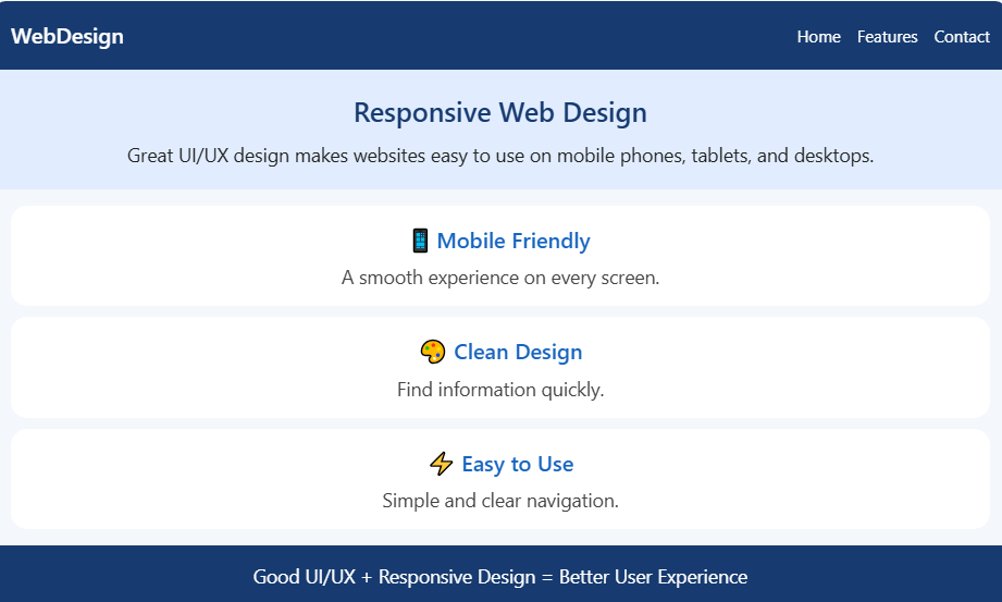
<!DOCTYPE html>
<html lang="en">
<head>
<meta charset="UTF-8">
<meta name="viewport" content="width=device-width, initial-scale=1.0">
<title>Responsive Web Design</title>
<style>
*{box-sizing:border-box}
body{margin:0;font-family:Arial,sans-serif;background:#f4f7fb;color:#222}
header{background:#173b70;color:white;padding:20px 8%;display:flex;justify-content:space-between;align-items:center}
nav a{color:white;text-decoration:none;margin-left:20px}
.hero{text-align:center;padding:60px 20px;background:#e1edff}
.hero h1{font-size:36px;color:#173b70}
.hero p{font-size:18px;line-height:1.6}
.features{display:flex;gap:20px;padding:30px 8%}
.card{background:white;padding:25px;flex:1;text-align:center;border-radius:10px;box-shadow:0 3px 10px #0001}
.card h2{color:#1765c0}
footer{text-align:center;padding:20px;background:#173b70;color:white}
@media(max-width:600px){
header{flex-direction:column;gap:15px}
nav a{margin:0 8px}
.hero h1{font-size:27px}
.features{flex-direction:column;padding:20px}
}
</style>
</head>
<body>
<header>
<h2>WebDesign</h2>
<nav><a href="#home">Home</a><a href="#features">Features</a><a href="#contact">Contact</a></nav>
</header>
<section class="hero" id="home">
<h1>Responsive Web Design</h1>
<p>Great UI/UX design makes websites easy to use<br>on mobile phones, tablets, and desktops.</p>
</section>
<section class="features" id="features">
<div class="card"><h2>📱 Mobile Friendly</h2><p>Enjoy a smooth browsing experience on every screen size.</p></div>
<div class="card"><h2>🎨 Clean Design</h2><p>Simple layouts help users find information quickly.</p></div>
<div class="card"><h2>⚡ Easy to Use</h2><p>Clear navigation makes every interaction easier.</p></div>
</section>
<footer id="contact"><p>Good UI/UX + Responsive Design = Better User Experience</p></footer>
</body>
</html>
OUTPUT:
Business Benefits of a Responsive, User-Focused Website
Good design isn't just about looking modern. It has a direct effect on how people behave on your site and how your business performs.
Lower bounce rates: When pages are easy to read and use, visitors stay longer and explore more.
More conversions: The presence of clear buttons and brief forms contributes to higher conversion rate.
Better search visibility: Mobile Friendly Web Design contributes to better results in the search because it is preferred by search engines.
Stronger brand trust: A good experience provided on any device gives the impression that the business is reliable.
Lower maintenance costs: One flexible site is easier to maintain than several versions of it.
Thus, the User-Friendly Website Design subtly gets rid of the minor hindrances, which cause users to leave the web page.
When to Bring in Professional Help
Some companies can manage changes on their own especially if they have a theme or system in place. Other companies get benefits from having specialists work on their site especially if the site is very big, old or connected to complicated features like online shops and reservation systems.
Expert Mobile Responsive Website Design Services usually include things like research sketches of the site layout designing the look building the site and testing it on devices. When you pick a company, look at the work they have done on phones well, as computers ask them how they do their testing and see if they think about how fast the site is and how easy it is to use from the beginning. A good Mobile Responsive Website Design team will ask about your users and what you want to achieve before they start talking about colors and how things look.
Conclusion
The process of making a website responsive may seem like a technical checklist. For example, you might add media queries, test the website on a phone, and assume the work is done. However, a successful website focuses on a bigger goal: making every visit comfortable, fast, and enjoyable.
When you combine flexible layouts with thoughtful interface choices, clear navigation, and quick loading, your website becomes easier to use. Moreover, real user testing helps you identify problems and improve the overall experience. As a result, visitors can find what they need, trust your brand, and feel more confident about returning.
Finally, start with just one improvement. For instance, test your homepage on your phone, simplify the navigation menu, or reduce the size of your largest images. By making small, consistent changes and listening to user feedback, you can gradually create a better website experience.
FAQs
1. What is the main goal of responsive web design?
Its goal is to give visitors a comfortable, consistent experience on any device. The layout and content adjust automatically to fit each screen size.
2. Is responsive design the same as mobile-first design?
Not exactly. Responsive design is the overall approach, while mobile-first is a strategy that starts with the smallest screen and scales up.
3. Does responsive design help with SEO?
Yes. Google mainly uses the mobile version of a site for ranking, so a site that works well on phones has a better chance of showing up in search results.
4. What are common breakpoints for responsive websites?
Many sites use breakpoints around 480px, 768px, 1024px, and 1280px. The best breakpoints, though, are wherever your own content starts to look awkward.
5. How can I check if my website is responsive?
Open it on a few real phones and tablets, and resize your desktop browser window. Browser developer tools and Google Lighthouse can also flag layout and speed issues.